The Best Service Pages for Contractor Websites: What Homeowners Need to See Before They Call
A contractor’s website does not lose leads only because it looks outdated. More often, it loses leads because the service pages do not answer the basic questions a homeowner has in the first 15 seconds.
Can you do the job I need? Do you work in my area? Can I trust you enough to call or fill out a form?
That is the whole game.
I have seen plenty of contractor websites with a decent homepage, a phone number in the header, and maybe a few project photos, but the service pages are thin, vague, or missing entirely. A roofing company has one page called “Services.” An HVAC company lists repairs, installs, and maintenance in three short sentences. A remodeler shows beautiful work, but never explains what kinds of projects they actually take. Homeowners land on those pages, hesitate, then back out and keep searching.
Strong service pages fix that. They help with local SEO, yes, but they also do something more practical. They make the homeowner feel like they found the right company before they ever speak with someone.
Service pages are where trust gets earned
The homepage gets attention, but the service page often gets the lead.
That is especially true for home service businesses in the United States, where people are usually searching with a specific need in mind. They are not looking for a contractor in the abstract. They are looking for “AC repair,” “pool builder near me,” “electrical panel upgrade,” or “roof leak repair.” If your page meets that moment clearly, you have a shot. If it does not, your site becomes a digital brochure instead of a lead generator.
Google has long treated business websites as more than online pamphlets. Calls to action matter because people can leave without doing anything. Small business guidance says visitors should quickly understand what you offer, and clear pages should help them find service categories and details when a business has multiple offerings. That fits the real behavior of homeowners. They scan, compare, and decide fast.
A good service page does not need hype. It needs clarity, relevance, and an easy next step.
What homeowners are really looking for on a service page
Most contractors write service pages as if they are trying to describe the company. Homeowners are usually trying to confirm a fit.
Those are not the same thing.
A homeowner on a plumbing page wants to know whether you handle the exact problem they have, how quickly they can reach you, whether you work where they live, and whether other people trusted you with similar work. If the page forces them to hunt for that information, you create friction. On desktop that is annoying. On mobile it is often fatal.
A mobile-first layout matters here more than many owners realize. A lot of contractor traffic comes from people standing in a hot house, in a driveway, or at work during a quick break. They are not reading a manifesto. They are trying to tap a number, see proof, and move on. Google’s own research around click-to-call behavior found that phone contact is deeply tied to local service buying behavior, which is why the best contractor sites make the phone number obvious and tappable on every service page.
That sounds basic, but it is still surprisingly rare.
The pages that usually matter most
You do not need fifty pages to start. You do need the right ones.
For many contractors, the most valuable pages are the pages for high-intent services, the jobs people actively search for when they are close to hiring. A roofer may need separate pages for roof repair, roof replacement, storm damage, and commercial roofing. An electrician may need dedicated pages for panel upgrades, EV charger installation, generator installation, and troubleshooting. A landscaper may need pages for design, installation, drainage, outdoor lighting, and maintenance if those are truly separate lines of work.
The mistake is lumping everything under one broad “Services” page and expecting homeowners to do the sorting.
There is nothing wrong with a summary page that links to each service. In fact, that can be useful. The problem comes when the summary page is all you have. Google’s small business guidance specifically supports having detailed pages for separate offerings when a business provides multiple services. That is not just for rankings. It mirrors how buyers think.
If a homeowner needs a pool renovation, a general page called “Pool Services” is weaker than a page that speaks directly to pool renovation, shows related photos, explains the process at a high level, and offers a fast way to ask for an estimate.
What the best service pages include
The strongest pages tend to cover the same core ground, but they do it in a way that feels natural and trade-specific. They do not read like a template.
A good service page should usually include these elements:
- A clear headline that matches the service the homeowner searched for
- A short opening section that explains what you do and who it is for
- A visible phone number and a short quote form, especially on mobile
- Local proof, such as reviews, project photos, or service-area references
- A specific call to action that tells the visitor what to do next
Those five pieces carry a lot of weight because they answer the immediate questions without making the visitor think too hard.
That last point matters more than website owners sometimes admit. Contractors often know their own services so well that they forget how confusing trade language can sound to a homeowner. “Building envelope restoration” may be technically accurate. “Fixing leaks and damaged exterior surfaces on commercial buildings” is easier to understand. Precision matters, but clarity matters more.
The difference between a broad page and a useful page
Let’s say you own an HVAC company. A weak page might say you handle “heating and cooling solutions for residential and commercial clients” and stop there. It is not false, but it does not help a homeowner decide.
A useful page would make things concrete. It would mention repair, replacement, or maintenance if those are the actual services offered. It would make the contact option obvious. It would reassure the visitor that they reached a real local company with current hours and a local phone number, which also aligns with Google’s local business guidance. It might show a few review snippets or before-and-after equipment photos. It would not overload the page with every technical detail under the sun, but it would provide enough substance to say, “Yes, this company handles what I need.”
That is the sweet spot.
The same logic applies across trades. A remodeler should not rely only on polished branding. Homeowners want to see the kind of projects you take. A fire protection company should make scope and service area easy to understand. A roofer should separate repair from replacement if those jobs serve different search intent. A pool builder should not bury new construction under a generic company page if that is a major revenue line.
Before-and-after galleries do more than decorate the page
Contractors often treat project photos like filler. Homeowners do not.
Photos are one of the fastest ways to reduce uncertainty. A clean gallery helps people picture your work in a real home, not just read about it. On service pages, galleries are especially useful when the photos are relevant to the service itself. A bathroom remodeling page should show bathrooms, not kitchens. A drainage page should show drainage problems and finished corrections, not a random patio.
This is where many sites miss a simple opportunity. They either hide all photos inside one portfolio section or they add giant galleries that slow the site down. Neither is ideal. Fast load speed still matters. A contractor site does not have to be fancy, but it should load quickly enough that people do not bounce before they see the proof.
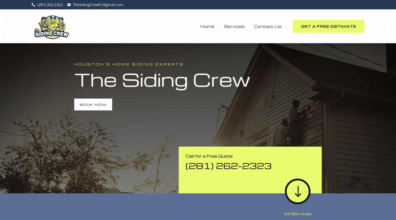
The practical answer is usually a tight, well-compressed gallery built directly into the relevant service page. A few strong images are better than forty heavy files that drag performance down.
Reviews belong on service pages, not only on a testimonials page
A separate reviews page is fine, but it should not be the only place social proof appears.
People often decide trust in the moment they are reading about a specific service. A homeowner on ScalableWebsites your electrical panel upgrade page should not have to click around to find out whether anyone has hired you for electrical work before. Consumer advice around hiring contractors regularly points people toward reviews and background checking behavior, so the instinct to look for proof is already there. Your site should meet it.
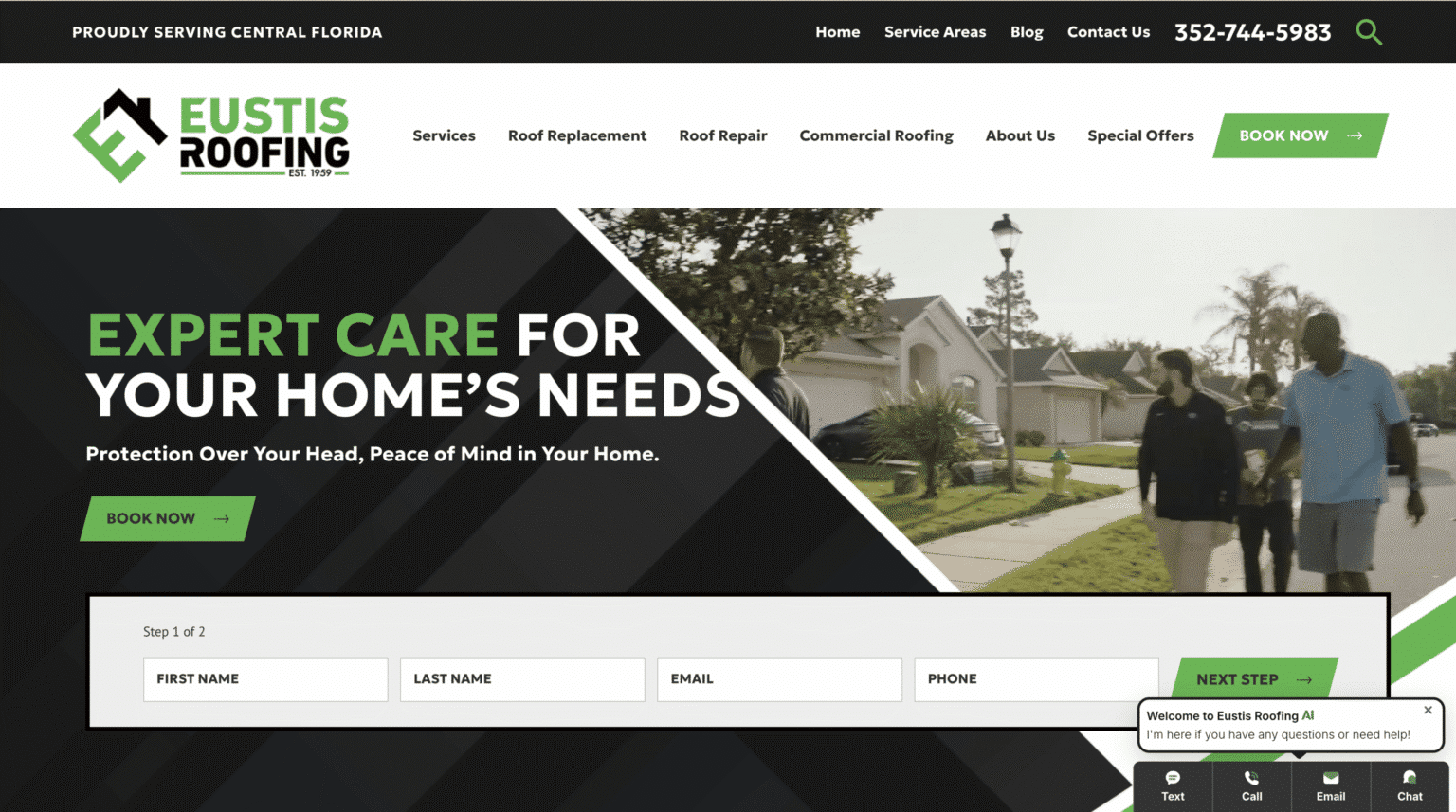
This does not mean stuffing every page with walls of praise. A few concise review snippets tied to the service can do the job well. If the page feels real and balanced, that helps. If it feels like nonstop sales copy, it can backfire.
The tone matters too. Simple, specific proof is stronger than chest-thumping. “Homeowners appreciate our quality workmanship” is fluff. A short review about responsiveness, cleanliness, or good communication during a project feels more believable.
Service-area pages and service pages should work together
This is one place contractors often leave money on the table.
A service page tells people what you do. A service-area page tells people where you do it. When those two structures support each other, both users and search engines have a clearer picture of your business.
If you serve multiple cities or suburbs, your website should make that easy to understand. Google has said that information from your official website can help inform how your business appears across its local ecosystem. That means consistency matters. Your website, your Google Business Profile, and your contact details should line up. Accurate hours matter. A local phone number can support trust and contactability. Your city pages should not be stuffed with nonsense, and they should not all say the exact same thing except for the city name.
A common pattern that works well is this: create detailed service pages for each core offering, then create service-area pages that explain where you work and link visitors into the relevant services. That way a homeowner in Sugar Land looking for roof repair can quickly see both that you offer roof repair and that you serve Sugar Land.
It sounds obvious on paper. In practice, many websites still make people guess.
Common service page mistakes that cost leads
Some website problems are cosmetic. These are not. These are the mistakes that actively get in the way of calls and quote requests.
The first is vagueness. If every page says “quality service” and “customer satisfaction,” the site says nothing memorable. Homeowners need specifics.
The second is overlong forms. Most contractor leads do not need a ten-field intake. Name, contact info, service needed, and maybe ZIP code is often enough for a first step. Short quote forms usually convert better because they ask for less commitment upfront.
The third is weak mobile usability. If the phone number is tiny, the form is awkward, or the page loads slowly on a phone, you are making it harder for the hottest leads to reach you.
The fourth is hiding contact information. Some owners seem afraid of repeating the phone number, but repetition helps. A strong service page should not make people scroll all the way back up just to call.
The fifth is neglecting response speed after the lead comes in. This is where missed-call text-back and live chat tools can help if they are implemented well. People shopping for urgent home services often contact more than one company. If you miss the call and never follow up, your website did its job and the business dropped the ball. Some contractors also use smart chat tools to answer common questions after hours and capture lead details when nobody is available. That can be useful, provided the chat does not get in the way of calling or form submission.
What a homeowner should understand within seconds
The best test for any service page is brutally simple. Open it on your phone and glance at it like a stranger.
Within a few seconds, a homeowner should understand the service, the area, the next step, and at least one reason to trust you.
If any of those pieces are missing, the page is not done.
That does not mean every page must look the same. A plumbing emergency page may need urgency and direct contact. A custom remodeling page may need more photos and more explanation. A landscaping design page may need stronger visuals and a more consultative tone. Organic structure is better than forcing every page into the exact same template.
Still, the user’s job should always feel easy.
A note on local SEO without the fluff
Local SEO gets overcomplicated in contractor marketing circles. The basics are more useful than the gimmicks.
Your service pages should use the actual terms homeowners search for, but naturally. Your city and service-area information should be accurate. Your phone number, business name, and hours should be consistent across your website and Google Business Profile. Your content should reflect your real business, not a pile of cloned pages created to chase every nearby town.
Google has also indicated that optimized landing pages connected to business profiles can surface critical lead-driving information such as phone number, hours, photos, reviews, and a primary call to action. That lines up neatly with what already works from a conversion standpoint. Good local SEO and good user experience usually point in the same direction.
When they do not, choose the version that helps the homeowner understand and contact you more easily.
Should you build these pages yourself or hire help?
This is where honesty matters. There is no single right answer for every contractor.
DIY website builders can work when the business is new, the budget is tight, and the owner has time and decent judgment about messaging. The downside is that many DIY sites end up slow, generic, or incomplete. Service pages in particular take more thought than they look like they should.
Freelancers can be a good middle ground if you find someone who understands contractor websites, writes well, and does not vanish after launch. The risk is inconsistency. Some are excellent. Some hand you a pretty homepage and weak interior pages.
Agencies can bring stronger systems, better design, and broader support, but they can also be expensive or overly process-heavy for small home service businesses. Some are great at branding but less sharp on what actually drives calls from local homeowners.
Managed website subscriptions have become appealing to many contractors because they spread the cost out and often bundle hosting, security, updates, and ongoing support. That model can make sense if the provider is responsive and the site keeps improving after launch. For example, Scalable Websites in Houston, Texas offers subscription-based websites for home service contractors through Douloi Inc. They include hosting, security, unlimited updates, and a dedicated project manager, which addresses a pain point many contractors have after the site goes live. The important question is not the pricing model by itself. It is whether the provider understands lead generation for home services and keeps the service pages current as the business changes.
That last part matters more than people think. A website is rarely “done.” New service lines get added. Service areas shift. Photos improve. Reviews come in. Hours change. Good service pages need upkeep.
A practical way to improve your existing pages
If you already have a website, you do not need a full rebuild before making progress. Start by reviewing your top money-making services and asking whether each one has its own page. Then open those pages on your phone and be honest about the experience.
Look for these issues:
- The page is too general and does not match a specific service need
- The phone number or form is hard to find on mobile
- There is little or no proof, such as photos or reviews
- The page does not clearly say where you work
- The next step is vague or easy to miss
Fixing those basics often does more for lead flow than chasing trendy design ideas.
A contractor website should not feel like a creative writing project. It should feel like a clear path from search to trust to contact. If the page loads quickly, reads well on a phone, offers tap-to-call, uses a short form, shows honest proof, and clearly connects services to service areas, it is doing the real work.
The pages that make the phone ring
Homeowners do not reward contractor websites for sounding impressive. They reward them for being useful at the exact moment they need help.
That is why the best service pages are specific. They show the actual work, describe the real service, reflect the true service area, and make contacting the business effortless. They respect how people buy local services, especially on mobile, where one bad experience can send the lead somewhere else in seconds.
If your site has traffic but not enough calls, do not start by blaming the market. Look at the service pages. They may be too broad, too thin, too slow, or too hard to act on. For many contractors, that is where the leak is.
And unlike some business problems, this one is fixable.
About Scalable Websites
Scalable Websites builds professionally designed, AI-powered websites for roofers, HVAC companies, plumbers, electricians, remodelers and other home service contractors, with hosting, security, unlimited updates and lead capture included in one monthly plan.
396 Mallorn Lane, Montgomery, TX 77316
Phone: (832) 979-2478
Website: scalablewebsites.com
About Scalable Websites
Scalable Websites builds professionally designed, AI-powered websites for roofers, HVAC companies, plumbers, electricians, remodelers and other home service contractors, with hosting, security, unlimited updates and lead capture included in one monthly plan.
Houston, TX · Serving contractors nationwide
Phone: (832) 979-2478
Website: scalablewebsites.com